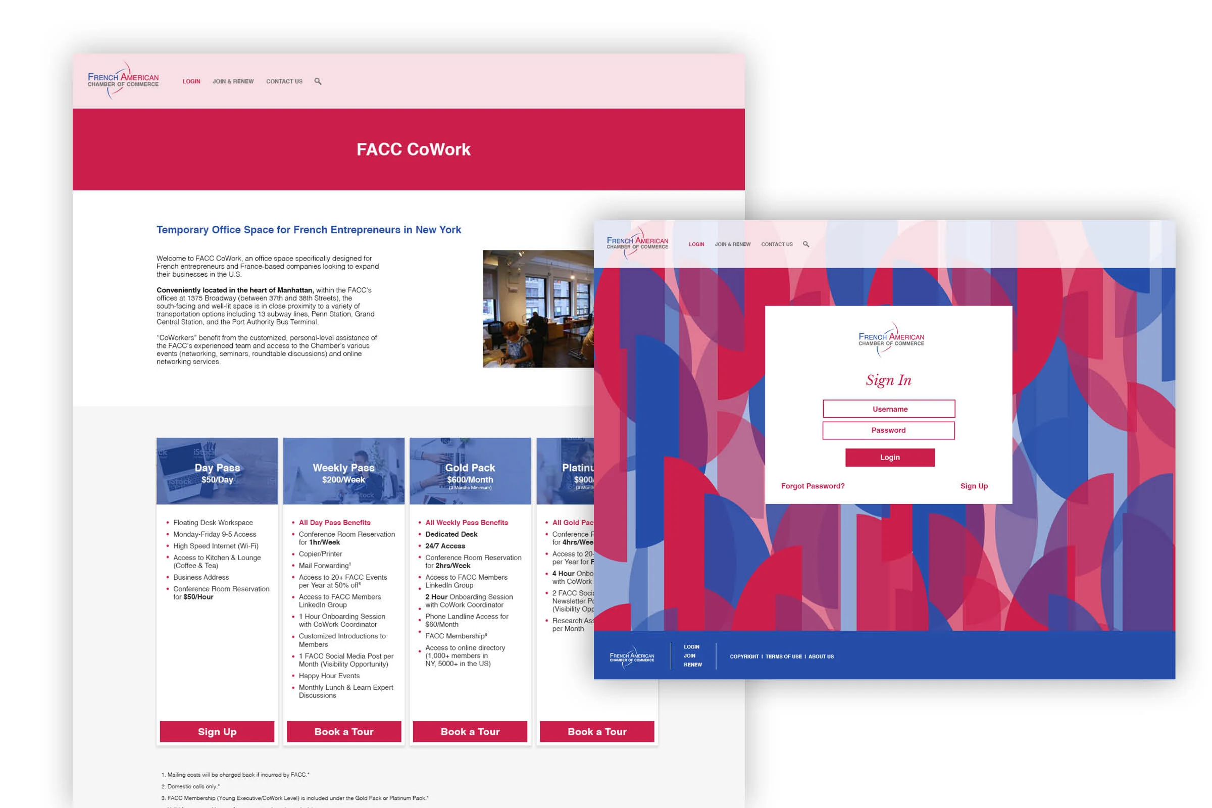
UX / UI Design
The French American Chamber of Commerce, NYC Chapter
Project: French American Chamber of Commerce Website Redesign
Scope: Implement new brand style into website design and UI and create a more intuitive UX
Skills Demonstrated: UX design, UI design, purposeful brand implementation
Details: The French American Chamber of Commerce (FACC) partnered with us at Advantages to uplift their brand and speak to their audience through their deeply rooted purpose. After going through an extensive Purpose Discovery with the Advantages Purpose Leaders and designing a whole new brand identity (aside from the logo), I was then tasked to implement their new brand language and visuals into their website, create a more intuitive experience for their audience, and uplift the integrity of the brand as a whole through the design and functionality of their website.
Results: The FACC was so pleased with their new beautiful website that they also asked us to implement this new brand into 4 of their other chapters’ websites across the country—Washington DC, Gulf Coast, Michigan, and Dallas.
Additional Credits: Website created alongside other teammates at Advantages including a creative director, developer, and a project manager.
Note: The FACC did not opt to have their website professionally managed, so the current design of the site looks and functions very differently than was originally designed.
Awards: Their new site design went on to win several awards, including W3, Muse, Communicator, GD USA, Hermes, and dotCOMM.
The design.
The FACC is a symbolic mosaic—a diverse collage of people from different backgrounds, languages, trades, and interests, all coming together for a common purpose. With this new image in mind, this exciting, multi-colored mosaic that was created during their brand identity build was then implemented into a structured story for their website. Each of their main services took on a different color from the mosaic creating a colorful yet clean aesthetic. Custom icons and maps were created to showcase their values, services, and locations all over the USA. Ultimately the design strongly reflected the FACC purpose and brought their community closer together.


